Portfolio Autopsy: What Art Directors Actually Look For in a Digital Sculptor's Reel

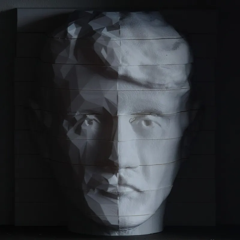
Photo: Dickinson Brothers, London, Public domain, via Wikimedia Commons
Reel reviews are not mysterious. Sit through an afternoon of them with a character art lead and the pattern becomes almost embarrassingly clear: the decisions that get you hired have very little to do with how heavy your mesh is or how many subtools you juggled.
Mostly it's about what a tired person with twelve more reels to watch can read in six seconds.
You Get Roughly Six Seconds
That's not an insult, it's a triage process. The reviewer is scanning for one thing early on — whether you can make a form that reads. If the first eight seconds answer that question, they keep watching. If it doesn't, they're on to the next file.
Which means the first piece in your reel does most of the work. Not the most technically elaborate piece. The most legible one.
Sequencing Is an Argument, Not a Highlight Reel
Weak reels are ordered by personal affection, chronologically, or by whatever exported cleanly. Strong reels are ordered like a persuasive essay, and the logic is usually: best and clearest hero first, second-best last, everything else in the middle.
That bookend structure sticks because reviewers remember openings and endings and forget the middle. If your most technically ambitious work — the thing with the sculpted scales and the forty-layer armor — is too busy to read in three seconds, it doesn't belong in slot one. Put it fourth, where someone already trusts you.
Aim for three to five pieces. Nobody is watching eight. Depth beats breadth every time.
The Silhouette Read
Here's a specific, repeatable test. Take a screenshot of your sculpt at two hundred pixels wide on a plain background, no rim light, no dramatic fog, no particle effects. Then shrink it to a hundred.
If it doesn't read as a character at that size, the design or the pose is doing the work and the sculpt is just along for the ride. Reviewers run this test visually whether they mean to or not, because that's what the character will look like in a game or across a room in a portfolio review.
Include at least one flat, untextured, neutral-light turntable of your hero piece. It's the least glamorous slide in the deck and the one that most reliably starts a conversation.
Process Shots: Show Decisions, Not a Timeline
A forty-second timelapse with music is entertainment. It's not evidence of a thought process.
What reads as professional is a short sequence of stills — blockout, mid-form, detail pass — plus one slide that shows a decision being made. A before-and-after showing a jaw you rebuilt. A side-by-side of an arm at two different proportional lengths. A note that says the shoulder was resculpted after a range-of-motion test kept clipping.
That last one signals pipeline literacy better than any finished render. It says you know the model has to live somewhere after you stop touching it.
The Signals Reviewers Actually Scan For
Strip out the noise and it comes down to a short list.
- Readability. Can the primary form be identified in a thumbnail?
- Point of view. Does the character look designed, or assembled from parts you've seen on ArtStation a hundred times?
- Proportion sense. Are the hands sized like hands, and do they look like they could grip something?
- Surface confidence. Are details placed where stress and wear would actually happen, or sprayed evenly because the brush was set to clay buildup?
- Pipeline awareness. Retopo, UVs, and a bake shown — or at least mentioned — on at least one piece.
- Restraint. Does anything look like it was carved by someone who knew when to stop?
You do not need to be world-class at all six. You need to be legible on four.
The Five Ways Reels Die
In rough order of frequency, from what people who do this for a living tend to say.
One good piece and ninety seconds of orbit. Variety of angle isn't variety of work. Move on.
Every piece the same genre. Four armored knights signals range anxiety, not range. One creature, one human, one hard-surface prop goes further.
No context. A sculpt floating in a void tells a reviewer nothing about intent. Give it a purpose, even a fake one.
Effects doing the heavy lifting. Fog, glow, dramatic composition, and post-processing are all ways of hiding whether the forms hold up.
Music mixed louder than the work matters. Nobody is scoring your reel. They're deciding whether to reply to your email.
The Eight Seconds to Invest In
If you only fix one thing, fix the opening. Lead with a clean, well-lit, fully readable piece with a fast turntable — three or four seconds — and put your name and role on screen once, briefly, not on a title card that costs you a full beat.
Then make sure the very next thing on screen is the flat, untextured version of that same piece. That pairing — beautiful, then honest — tells a reviewer everything they need in the time it takes to sip coffee.
The Uncomfortable Part
Most rejections aren't about your ceiling. They're about readability and whether a stranger can tell how you think. Artists with genuinely stunning sculpts get passed over every week because the reel made them look like a hobbyist who happens to be talented at detail.
The fix is cheap: ask one working professional for a single, specific critique. Not a general impression. Ask them which piece they'd cut and what the first three seconds of their reel said to them. The answer is usually a small edit with an outsized return.